INTERESTING STATISTICS AND CHARTS RELATED TO:
CLIMATE POLICIES, ENERGY AND INTERNATIONAL COMPARISON.
The intention in this page is to set out some interesting and useful charts for readers looking for a better grasp of the hard facts that sit behind the debates on climate and energy policy, and also to indicate some useful information sources. Creating this collection will take a little time, so the layout of this page will change as new charts and sources are added. Occasionally I will use a particular chart to illustrate a more substantial comment in the main blog section. For the moment here are a few tasters on global trends and international comparisons.
Introduction.
Large volumes of statistical data, especially in contentious areas like economics, energy and climate, often need a substantial amount of explanation and qualification. This is accentuated in international comparisons, not least because of differences or inconsistencies in data collection, classification, frequency of collection, and reliability. My comments will try to take these into account, but readers may also want to go back to the sources, which I will normally quote, for the provenance and the fine detail. Some of the most interesting statistics are not necessarily collected on a regular basis, or take a long time to assemble,so data sets for 2013, for example, may well be the latest or the only information readily available in that format.
A very common speculation, in popular discussion of climate policy and international responsibilities, is the extent to which emissions have been driven by population, economic growth and other factors. The following chart provides a partial answer to this question, showing growth in emissions over the last four full decades, attributed to four factors - population growth, real income growth (GDP), the energy intensity of GDP and the carbon intensity of energy production.

Source: IPCC
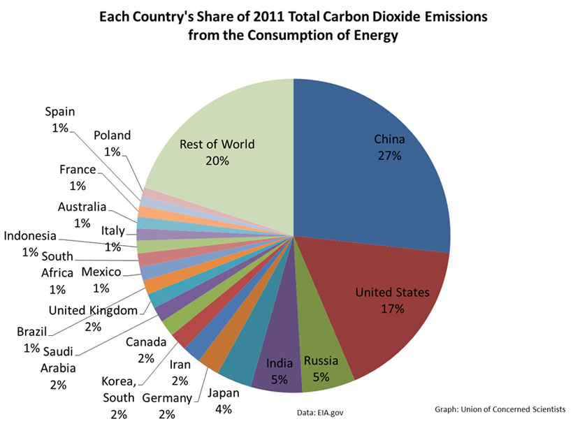
We can get more information by looking at country by country data. The following table is reproduced from a 2015 report on trends in global emissions.

[source; Olivier JGJ et al (2015) Trends in global CO2 emissions; 2015 Report, The Hague; PBL Netherlands Environmental Assessment Agency; Ispra; European Commission Joint Research Centre]

What is more surprising is analysis of which countries have the highest per capita emissions:

And what is actually happening to global temperatures?

No comments:
Post a Comment